Popular colors and styles for Bsmart interior
In the fast-paced rhythm of modern life, Bsmart interior is more than just objects in a space. It’s a place where emotions are touched through color and style. 2026 opens a new journey, where the colors of nature speak. The green of the forest, the brown of the earth, the soothing hues of the sea, or the warm golden light of the afternoon sun. Each shade permeates every corner of the home, whispering of peace, healing, and balance. Stepping into the world of Bsmart furniture is like being lost in a garden of emotions. There, every line, every shade tells a story of a refined, profound, and inspiring lifestyle.
1. Popular color palettes in Bsmart interior design 2026
The year 2026 celebrates color palettes that promote healing and peace. Therefore, color schemes inspired by nature will be the dominant trend. Below are some typical color palettes that are expected to be popular in 2026.
Spring Green – Renewable energy for Bsmart interior
Inspired by the moment nature awakens as spring arrives, the space is enveloped in shades of green and coral red-orange, evoking a feeling of freshness, gentleness, and vitality. The soft green hues spread balance and healing power, like the fresh breath of young plants, helping the mind to relax and find peace. Against this green backdrop, the coral red-orange accents appear subtly like the early morning sun, warm enough to awaken positive energy, creativity, and emotional connections within the family, yet maintaining a soft, understated elegance.
When applied in Bsmart interior designs, the olive green sofa combined with coral orange cushions creates a youthful, soothing, and inspiring living room space. This harmonious overall look is especially suitable for young families who appreciate sophistication and desire a living space that is always fresh, balanced, and full of positive energy every day.
Desert sand – Reflections and depth
The interior space, with its desert sand tones, evokes a sense of profound contemplation, transporting one back to the vast sand dunes bathed in the golden sunlight of pristine nature. The main color palette, consisting of earthy browns, beiges, sandy yellows, and terracotta, blends subtly, creating a tranquil and elegant overall effect. Simultaneously, it exudes maturity, warmth, and a rich emotional depth.
When applied in Bsmart’s designs, this color palette harmoniously combines with natural wood, soft fabric sofas, and gentle yellow lighting. It creates a feeling of intimacy while maintaining a discreet elegance. The space becomes pleasant, relaxing, and contemplative. It’s particularly suitable for townhouses or villas in the organic and wabi-sabi styles, where original beauty, natural imperfection, and simple values are cherished. From this, living spaces are created with depth, tranquility, and lasting warmth, connecting people with nature and their own emotions.
Cool blue color palette – Minimalist and effective
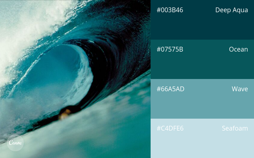
The interior space, bathed in cool shades of blue, evokes a sense of peace and tranquility. It’s a place where minimalism is elevated to a refined art of living. The color palette uses sea blue as the dominant tone, ranging from dark to light, skillfully combining different shades within the same color to create visual depth while maintaining a light and streamlined feel. The color effect makes the space feel airy and comfortable, simultaneously radiating a relaxing energy, like gentle ocean waves caressing the mind.
This color palette is particularly ideal for bedrooms, bathrooms, or apartments with limited space, where a sense of spaciousness and tranquility is key. The subtle monochromatic combination also highlights materials, architectural lines, and natural light. It suits minimalist, Scandinavian, and modern styles, creating an overall space that is both simple and sophisticated, achieving high effectiveness in both aesthetics and emotional experience.
Trees and nature – Sustainable identity for Bsmart interior
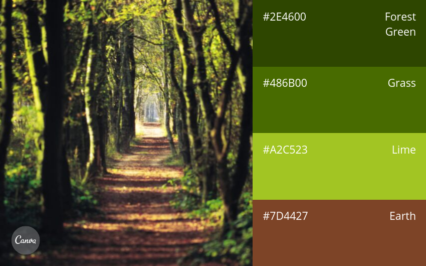
Inspired by trees and nature, this palette infuses a green breath into every corner of the living space. It creates a warm, harmonious, and sustainable environment. The combination of green and wood brown creates an overall effect that is both fresh and warm, reminiscent of lush green foliage intertwined with sturdy tree trunks. The space thus evokes a sense of tranquility, as if one were living amidst pristine nature.
This color palette not only highlights green accents but also spreads a sense of tranquility, balance, and enhanced connection with the surrounding environment. When applied to interior design, it is an ideal choice for eco-friendly homes, where natural values are respected and subtly utilized. The overall space becomes vibrant and full of life, while maintaining a modern, streamlined, and sustainable feel over time.
A soft, delicate color palette – Romantic and emotional

The color palette, with its soft and delicate shades, opens up a space imbued with romance. It evokes the charming, old-fashioned European scenes from sweet, romantic films. The blend of turquoise, warm yellow, and tulip pink creates a gentle overall effect, as if the space is bathed in a dreamy, subtle, and feminine light.
Turquoise evokes a sense of peace, calming the mind and guiding emotions into a relaxed state. Yellow, like the morning sun, radiates warmth and positive energy. Meanwhile, tulip pink touches deeper emotions, bringing romance, softness, and poetic charm to the space. When applied in interior design, this color palette is particularly suitable for bedrooms or apartments that prioritize artistry, where every detail is carefully considered to create a soothing, inspiring living space and provide a complete emotional experience for the homeowner.
Natural green tones for Bsmart interior
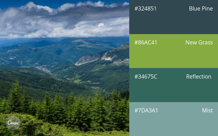
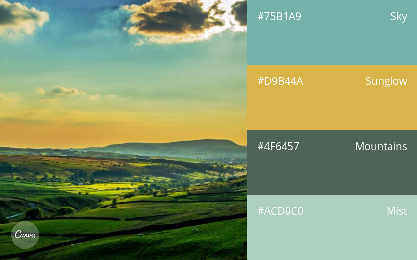
A natural green color palette unfolds a vibrant ecological panorama, where each shade tells its own story of nature and human emotion. The harmonious blend of forest green, sky blue, water blue, and grayish-blue creates a multi-layered space that is both profound and refreshing, offering a sense of openness, balance, and ultimate relaxation.
Forest green evokes a sense of stability, reminding us of a lasting connection with trees and nature. The gentle, ethereal blue of the sky is like fresh air spreading throughout the space. The cool, serene blue of the water inspires relaxation and peace. Meanwhile, gray-blue acts as a connector, creating visual depth and maintaining balance throughout the overall design. When applied to design, this color palette is particularly suitable for resort villas, open spaces, or areas requiring close harmony with nature, where light and color blend to create a fresh, energetic, and emotionally rich atmosphere.
Surf & Turf Color Palette – Sea and Land
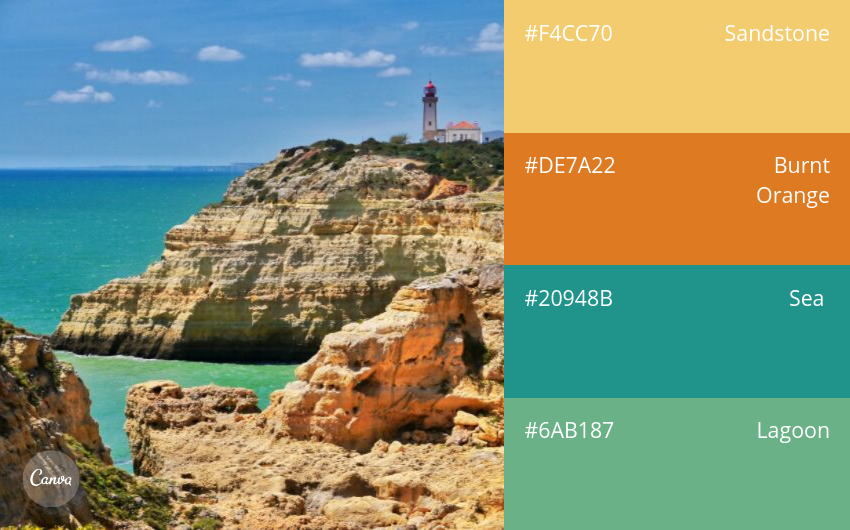
This color palette brings a delicate balance to Bsmart’s interiors, bridging two seemingly opposing yet perfectly complementary natural elements: the refreshing coolness of the sea and the warm, enduring warmth of the land. Using sea blue, sandy shades, and warm browns as the main tones, this color scheme creates a harmonious whole—soothing enough for relaxation, yet warm enough to foster a sense of closeness and familiarity. As a result, the space becomes more pleasant, receives more natural light, and radiates positive energy.
Within the same color palette, sea blue evokes a sense of peace and openness, like standing at the boundary between sky and water. The gentle sand tones act as visual neutralizers, making the space soft, balanced, and easy to appreciate. Warm browns, like the setting sun on the beach, bring emotional depth and a feeling of complete relaxation. This color scheme is especially ideal for living rooms, bedrooms, or other relaxing spaces where people find a balance between fresh energy and natural warmth, opening up a soothing, intimate, and emotionally positive living experience.
Insects and flowers – The vibrant colors of the living ecosystem

Inspired by the world of insects and vegetation, this color palette opens up a rhythmic living space where nature and biodiversity become the direct inspiration for every design detail. The breath of a natural garden is brought into the space through the subtle blend of green leaves, vibrant flower colors, and the distinctive, lively tones of insects. All come together to create a vivid, harmonious, and energetic visual tableau.
Beyond its aesthetic value, this color palette also radiates a sense of vitality, freshness, and inspires creativity in anyone who enters. When applied in Bsmart’s designs, these natural colors make living spaces feel intimate, friendly, and full of energy. The interaction between color, light, and natural elements is maximized, providing a vibrant, natural, and emotionally resonant experience.
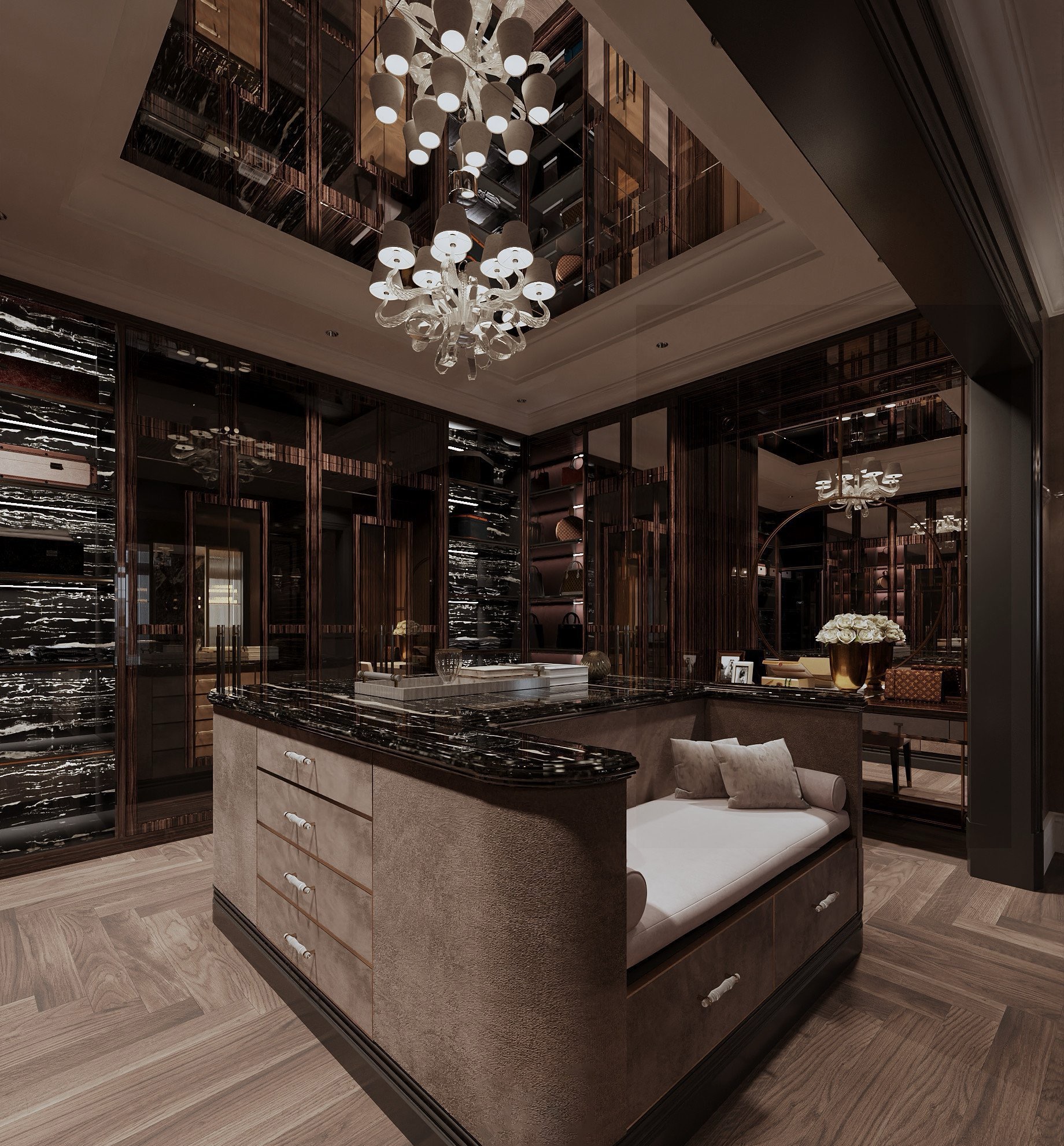
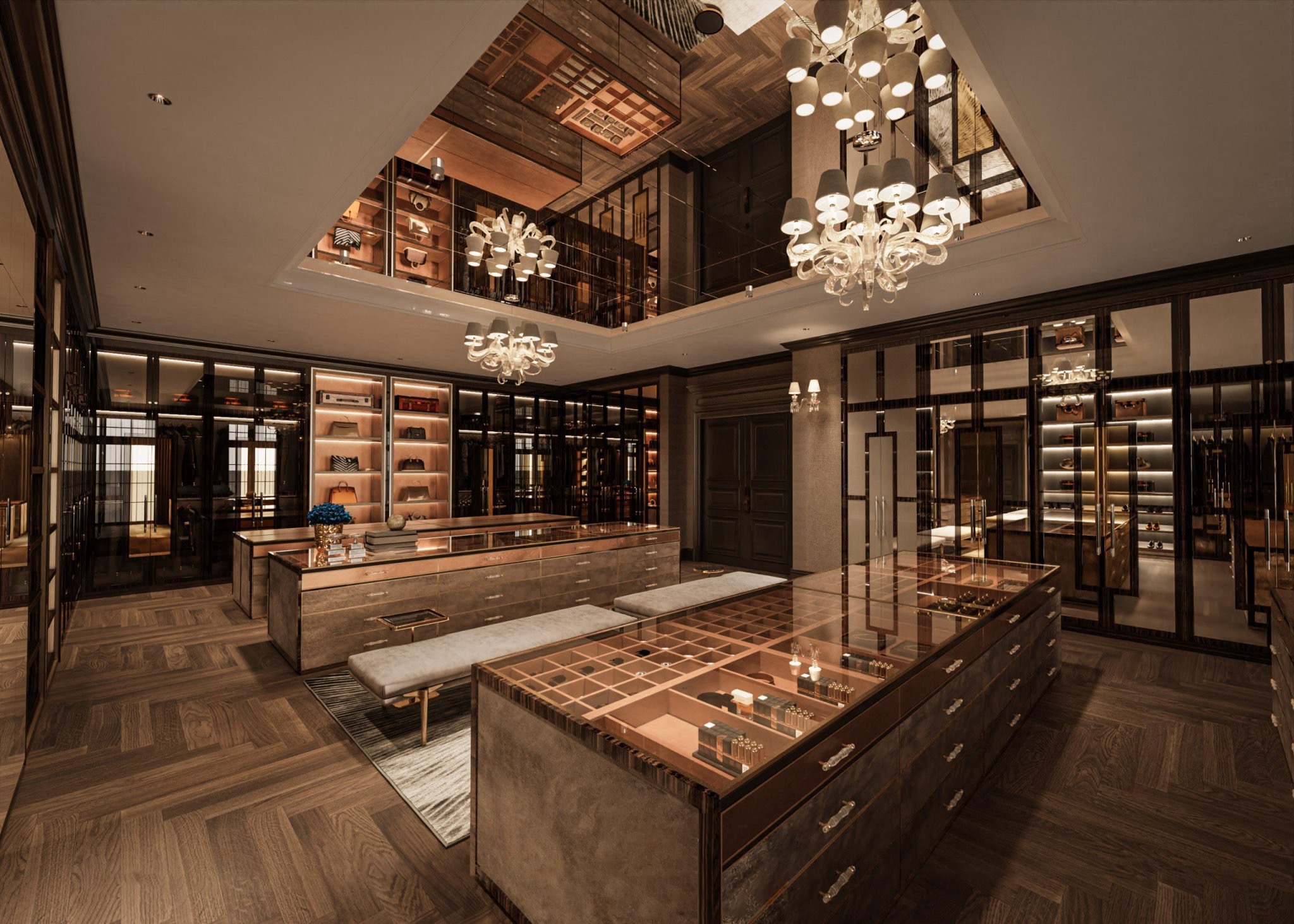
>> See more:Top 4 interior design trends for Bsmart dressing rooms.
Retro-inspired natural color palette – a blend of nostalgia and modernity
A retro-inspired color palette opens up a space where memory and modernity meet. There, the nostalgic feel is skillfully balanced to avoid appearing outdated, instead creating a distinctive, captivating, and profound overall effect. Olive green, muted yellow, and classic brown – shades reminiscent of the 1950s – form the visual foundation for a sophisticated and unique mid-century style.
Olive green evokes a sense of tranquility and depth, yet remains close to nature. Deep yellow resembles the gentle sunlight of bygone afternoons, warm enough to create a focal point without being ostentatious. Meanwhile, classic brown acts as an emotional anchor, providing stability, overall balance, and depth to the space.
When applied in Bsmart, this color palette is particularly suitable for artistic spaces or mid-century style rooms. Each shade is intentionally chosen, creating a subtle blend of individual personality and overall harmony. The space thus becomes rich in focal points, eye-catching but not visually cluttered, providing a vibrant and captivating experience for the user.
2. Color matching rules in Bsmart interior design
The 60-30-10 Rule – The Foundation of Visual Balance
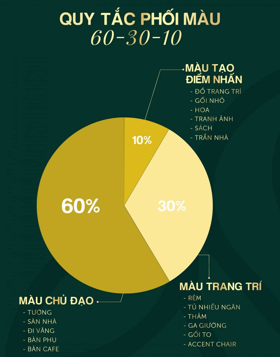
The 60-30-10 rule is considered the “backbone” of interior color coordination. It is particularly well-suited to Bsmart’s design philosophy, which emphasizes harmony and ease of application. In this rule, 60% of the background color plays a crucial role in shaping the overall mood of the space. This color scheme typically appears on walls, ceilings, floors, or large furniture pieces. This color palette needs to be neutral or soft to create a solid foundation and a lasting sense of comfort.
30% of the secondary color helps add depth and personality. This is often expressed through interior details such as sofas, curtains, rugs, or cabinetry. It contributes to a more vibrant space while maintaining control.
The 10% accent color represents a subtle emotional touch. It’s often expressed through throw pillows, decorative items, wall art, or carefully chosen small details. Although it’s a small percentage, it creates a distinct visual impact and reflects the owner’s personal aesthetic. When applied to Bsmart interior spaces, the 60-30-10 rule helps create a balanced, visually appealing, and versatile overall look that suits various styles. This is a safe yet far from monotonous color scheme, allowing users to refresh their space flexibly while maintaining its inherent harmony.
Monochromatic color scheme in Bsmart interior design – Minimalist yet rich in depth
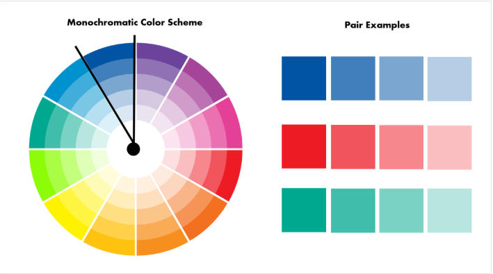
Monochromatic color schemes are the art of using a single dominant color with various shades and intensities. The goal is to create a sophisticated, modern, and deep space, rather than relying on the richness of many colors. This method focuses on exploiting color transitions, light, and texture, thereby providing a seamless, clean, and pleasing visual experience.
In Bsmart’s interior designs, monochromatic color schemes are often preferred for modern apartments, bedrooms, or spaces with limited area, where airiness and a sense of spaciousness are paramount. Lighter shades help create a light and relaxing atmosphere, while bolder tones are used strategically to create accents, add depth, and draw the eye.
When combined with materials like wood, fabric, metal, or warm yellow lighting, monochromatic spaces become more vibrant and emotionally rich, avoiding the usual monotony. Monochromatic color schemes are understated but require subtlety in choosing shades and proportions. This clearly reflects the minimalist, streamlined, and efficient spirit that Bsmart pursues, delivering lasting aesthetic value over time.
Matching colors – Harmonious and natural

Analogous color schemes are based on combining colors that are next to each other on the color wheel. This creates a smooth and pleasant transition for the eye. This method has a strong natural feel, often evoking images of natural landscapes such as forests, seascapes, or sunny beaches.
In Bsmart interiors, the use of complementary color schemes is effectively applied to living rooms, bedrooms, or common areas where relaxation and emotional connection are prioritized. The biggest advantage of this rule is its safety and harmony, making the space look seamless and inviting without causing visual fatigue.
However, to avoid blandness, it’s necessary to clearly define the dominant color, supporting colors, and accents through shades, textures, or lighting. When handled skillfully, harmonious color combinations create a soft, sophisticated overall effect, in line with Bsmart’s design philosophy focused on long-term user experience.
Contrasting color schemes in Bsmart interior – A strong and distinctive highlight
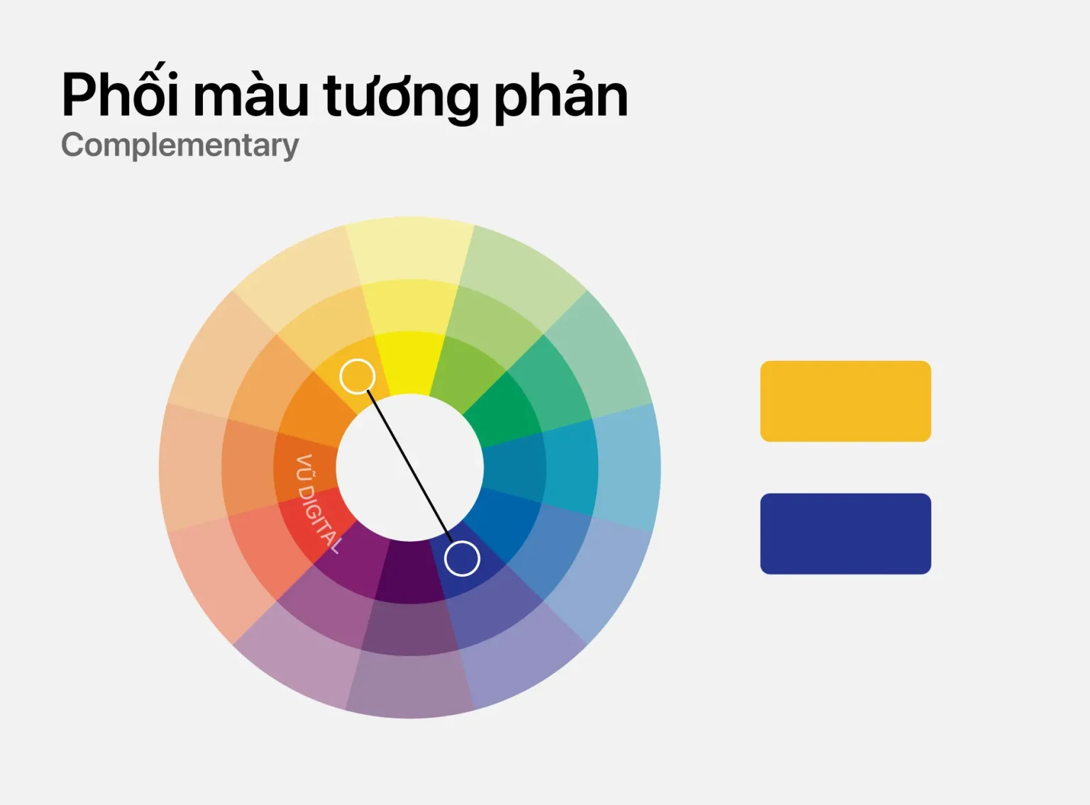
Contrasting color schemes use two colors opposite each other on the color wheel. This creates a strong and striking visual effect. This is a rule for spaces that need to express personality, energy, and prominence.
In interior design, contrasting colors are often used in display areas, personalized living rooms, or creative spaces—places where attention needs to be drawn from the very first moment. The contrast between colors helps to highlight shapes, lines, and design details.
Furthermore, to avoid creating a stressful or visually overwhelming atmosphere, controlling color proportions is crucial. Typically, one color will play a dominant role, while the other is used as a deliberate accent. When applied correctly, contrasting color schemes not only create a strong visual impact but also bring a dynamic, modern, and vibrant feel to the space.
Alternating complementary color scheme – Controlled contrast
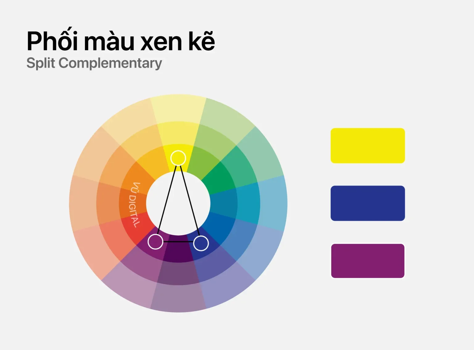
The complementary color scheme is a more subtle variation of the contrasting color scheme. It uses opposing colors in moderate intensity and proportion. Instead of creating a direct contrast, this method allows colors to appear interspersed, helping to maintain visual balance while still providing clear focal points.
From Bsmart’s design perspective, this principle is particularly suitable for family living rooms and workspaces – places that require just the right amount of vibrancy and emotional richness without creating visual pressure. Colors are strategically distributed through furniture, decor, and small details, creating a gentle yet captivating visual rhythm. The interweaving of complementary colors makes the space flexible, adds depth, and adapts well over time. This also clearly demonstrates Bsmart’s modern design philosophy: always prioritizing user experience and emotions.
Complementary color scheme of the trio in Bsmart interior design – Creative and dynamic
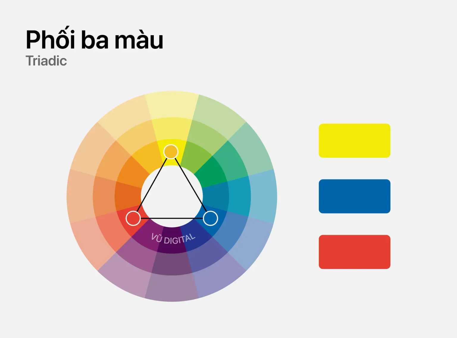
The complementary triadic color scheme uses three colors evenly spaced on the color wheel. It offers a balance between diversity and harmony. This is a highly energetic color combination, often evoking a youthful, creative, and dynamic feel.
This color scheme is suitable for creative spaces, living rooms, or apartments for young families. To achieve a high aesthetic effect, it’s necessary to identify a dominant color, with the other two acting as supporting or accent colors. When combined with neutral materials and appropriate lighting, this three-color complementary palette doesn’t create visual clutter. On the contrary, it creates a very unique personality, reflecting an open, modern spirit and a willingness to experiment – perfectly in line with today’s dynamic lifestyle.
Complementary color scheme of 4 – High personality and design depth
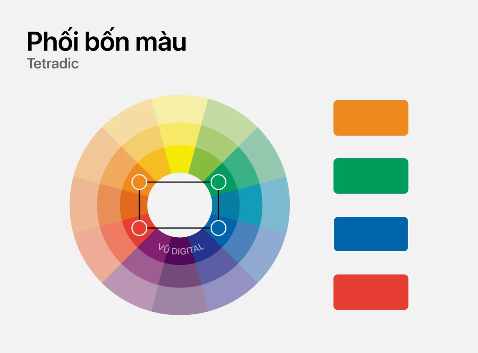
The four-color complementary scheme is the most complex method. It uses two pairs of colors opposite each other on the color wheel. This rule creates a multi-layered space, rich in depth and with a strong personal touch.
Following Bsmart’s design philosophy, the four-color complementary palette is often applied to projects with a high artistic value, such as large villas or spaces designed by professional designers. Controlling the proportions, shades, and roles of each color is crucial to avoid visual clutter. When handled subtly, the four-color palette offers a rich visual experience, clearly reflecting the design philosophy and personality of the space. This is the choice for those seeking uniqueness, originality, and aesthetic depth that transcends conventional norms.
>> See more: Bsmart Interior Design – Classical Art Blending with Modern Style.
3. Color coordination according to design style
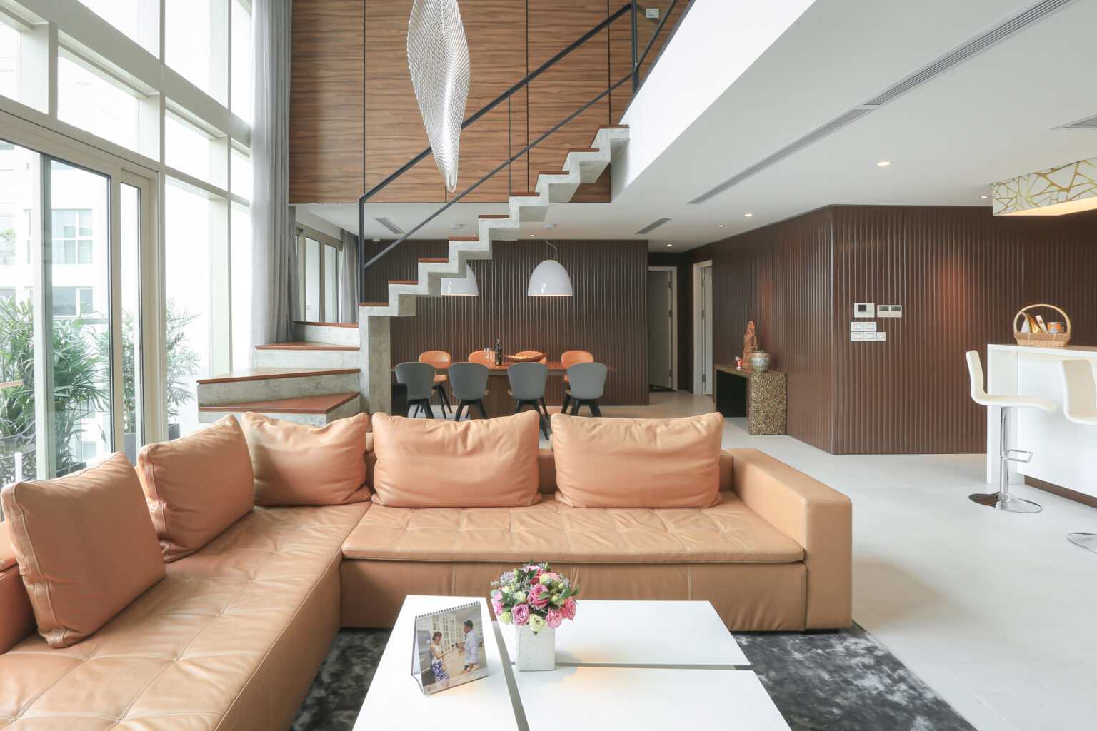
Modern style – Sleek, balanced, and versatile
The modern style in Bsmart’s interior design is typically defined by a neutral color palette of white, gray, black, and blue. This creates a streamlined, clear, and highly functional overall look. White serves as the foundation, providing a sense of spaciousness, cleanliness, and expanded space.
Gray acts as an intermediate layer, balancing the visual space and increasing its depth. It also highlights the shapes of the interior. Black is used sparingly to emphasize lines, creating visual anchors and adding sharpness to the overall design. Meanwhile, neutral blue provides a calming effect, making the space less rigid and more inviting.
When applied in the spirit of Bsmart, the modern color palette is not only aesthetically pleasing but also versatile, easily adapting to various spaces and functions. This combination is particularly suitable for urban apartments, family living rooms, or workspaces that require neatness and logic while maintaining a comfortable and modern feel over time.
Mediterranean style – Freedom, sunshine, and emotion
The Mediterranean style in Bsmart is expressed through a color palette of sea blue, white, and sunny yellow. These colors evoke images of sun-drenched, breezy coastal regions. Sea blue is the dominant color, bringing a feeling of coolness, spaciousness, and deep relaxation. It’s like opening up a slow-paced living space amidst the hustle and bustle of life.
White serves as a backdrop, balancing the blue tones, increasing brightness, and creating an overall sense of lightness. Subtle touches of sunny yellow add warmth, enlivening the space and evoking a deeper emotional connection. In Bsmart’s designs, this color palette is often combined with natural materials, rustic surfaces, and natural light to emphasize a free and uninhibited spirit. The Mediterranean style is particularly well-suited to living rooms, resorts, or nature-loving homes, where color isn’t just for decoration but also creates a serene, relaxing, and inspiring living experience.
Nordic style – Gentle and warm
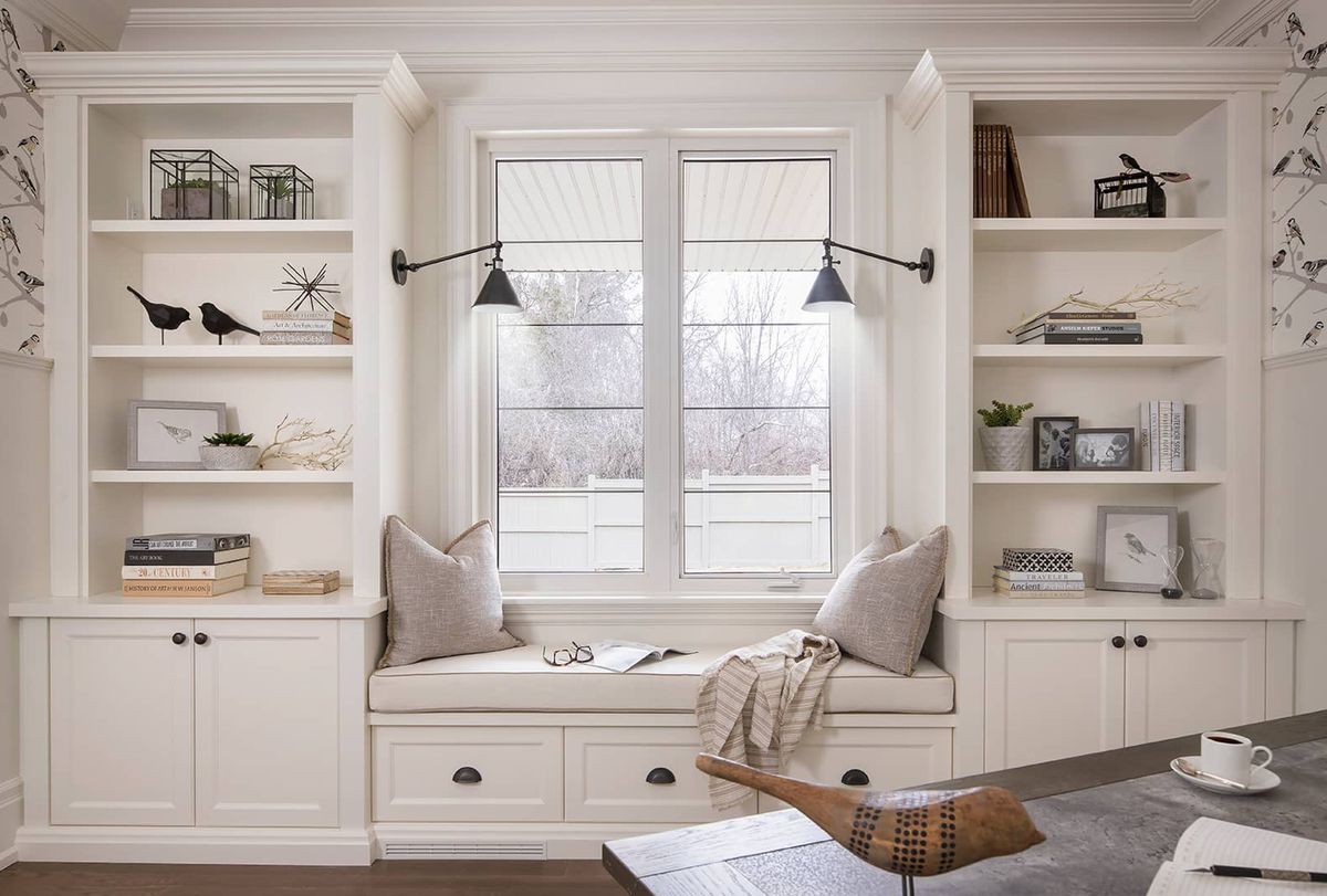
The white-gray-light wood-pastel blue color palette forms the core of the Scandinavian style in Bsmart’s design. Minimalism is always accompanied by a warm and inviting atmosphere. White plays a dominant role, reflecting light and making the space feel spacious and pure. Light gray adds visual depth, creating balance without losing the inherent lightness. Light wood brings a natural feel, creating warmth and connecting people to their living space. The subtle pastel blue accents add a touch of freshness without disrupting the overall minimalist aesthetic.
In the Bsmart design system, the Scandinavian style is very suitable for small apartments, bedrooms, or common living spaces where comfort and functionality are prioritized. This color scheme is understated yet enduring, providing a lasting sense of peace and tranquility.
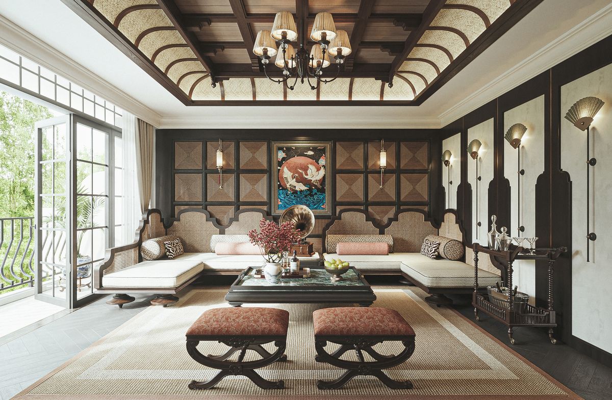
Neoclassical style – Elegant and profound
The Neoclassical style in Bsmart is built on a color palette of beige, cream, gold, and dark blue. This creates an elegant and luxurious look without being heavy. Beige and cream serve as the main base, providing a soft, graceful, and pleasing visual experience. Dark blue appears as an accent, adding depth and a sense of calm and emotional resonance to the space.
Meanwhile, gold is used sparingly in decorative details, handles, and interior trim, contributing to an elegant yet understated look. When handled in the Bsmart style, the Neoclassical color palette maintains a balance between classic and modern elements. It’s suitable for large living rooms, villas, or spaces requiring a refined aesthetic. This style is for those who appreciate enduring luxury, subtle elegance, and rich emotional depth.
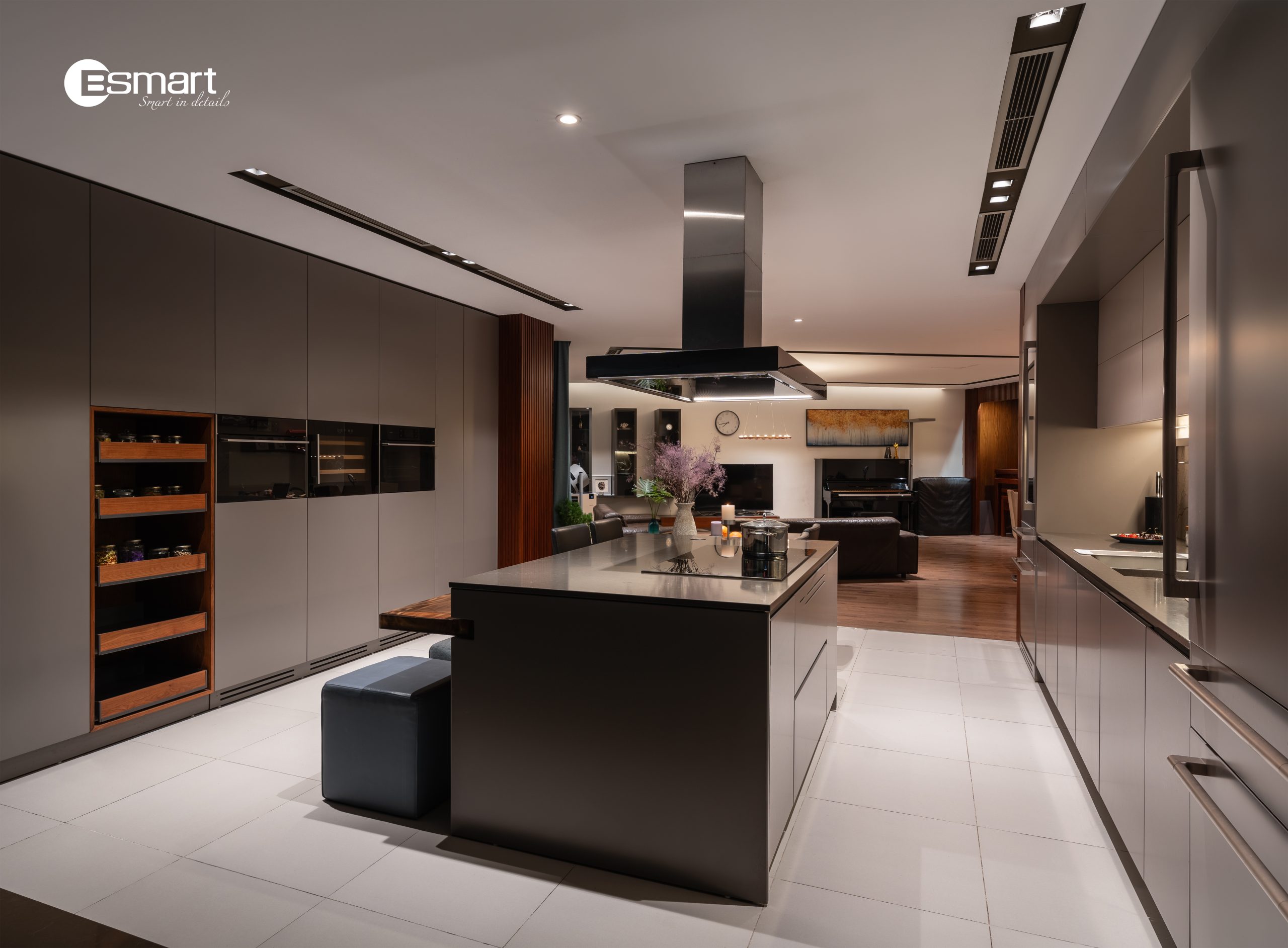
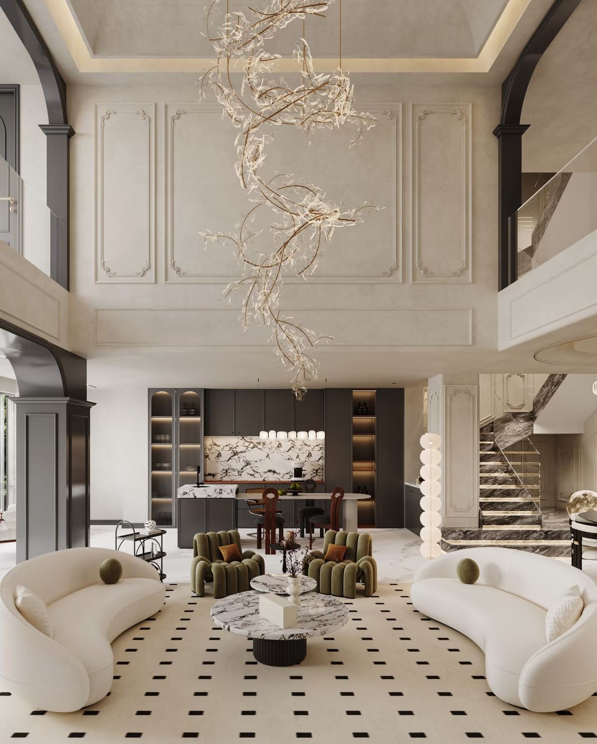
Luxury Style – Power and Class
The Luxury style in Bsmart’s design utilizes a color palette of black, charcoal gray, deep brown, and metallic tones. This creates a powerful, sophisticated, and profound space. Black and charcoal gray evoke a sense of power, depth, and refined modernity. Helping the space assert its unique personality clearly and strongly. Deep brown acts as a balance, providing warmth and emotional depth while reducing the coldness often associated with darker colors.
Metallic details such as bronze, chrome, or champagne gold are used selectively, creating a luxurious effect and subtle light reflection. In Bsmart’s signature designs, the Luxury style doesn’t aim for ostentation. But focuses on the quality of the space, the tactile feel and the visual experience. It is particularly suitable for luxurious living rooms, high-end apartments…Clearly showcasing a sophisticated lifestyle and a strong, modern aesthetic taste.
>> See more: Bsmart offers consulting and design solutions for kitchen cabinet spaces.
Conclude
Concluding its journey of exploring color and style. Bsmart interior emerge as a gentle invitation. For those yearning for a living space with emotional depth. Where color is not merely decorative but becomes the breath of the home, guiding towards peace and balance. Each color palette, each combination, evokes a refined lifestyle. A place where people connect with nature and themselves. Choosing Bsmart interiors means choosing a complete living experience. Where every corner is capable of nurturing emotions, cultivating positive energy. And continuing to write an inspiring story of life each day.
=====\
BSMART – SMART IN DETAILS
Website: https://bsmart.vn/vi/
Fanpage: https://www.facebook.com/bsmart.vn/
Hotline:
Hà Nội: 0853 388 668
Hồ Chí Minh: 0903 425 885
Showroom address:
Hà Nội: 230A Hoàng Ngân, Phường Trung Hòa, Quận Cầu Giấy, Hà Nội.
Hồ Chí Minh: 76 Bát Nàn, Phường Bình Trưng, Tp. Hồ Chí Minh.
#noi_that_bsmart_hien_dai; #noi_that_bsmart_thong_minh
#noi_that_bsmart_dep; #noi_that_bsmart_sang_trong