Choose colors for the rooms in your house
The choice of colors plays a very important role to help express the ideas and design style in your home. Each room in the family has different functions and uses, so it is not necessary to use a single color tone uniformly. We can flexibly use colors in rooms to create a different feeling when entering each room. When you need to relax you can go to the reading room or bedroom, you can also help your child stimulate creativity and dynamism by designing a children’s room with playful colors.
Basic color tones
Basically, color tones are divided into 3 types:
– Cool tones: including blue colors such as green, blue, purple,…
– Warm tones: including colors such as orange, red, yellow,…
– Neutral color tone: black, white, gray.
Let’s learn in detail about the color gamut and application of each type below!
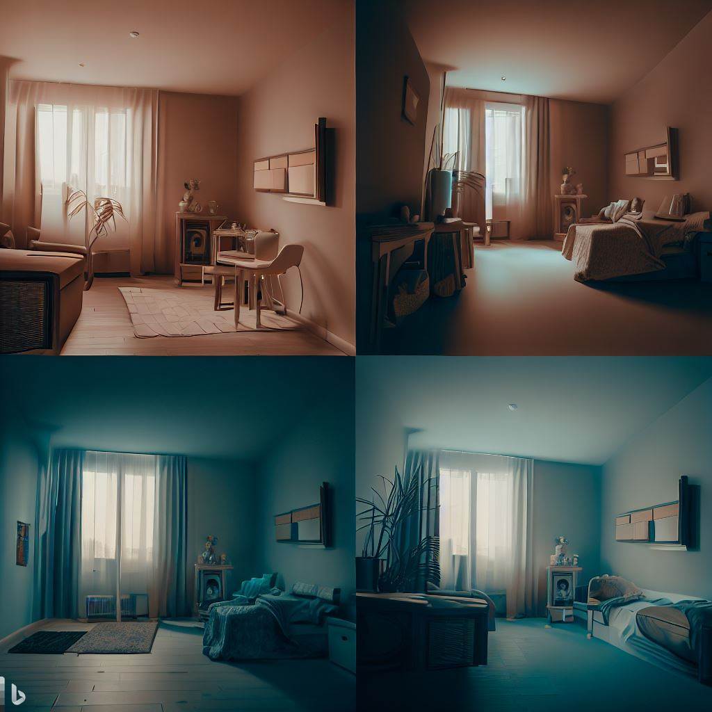
Cool tones
Cool tones are blue colors such as green, blue, purple,…
Using cool tones in the room will help you create a feeling of spaciousness, comfort and comfort.
Cold color tones can help reduce blood pressure, body temperature should be recommended for bedrooms, reading rooms, especially suitable for small spaces, not used for large spaces.
In terms of design style, cool tones are often used for modern style designs. The combination of cool colors with neutral colors such as black and white makes the space less monotonous. At the same time, accents of sunny colors and maximizing natural light will help make your home space bright.
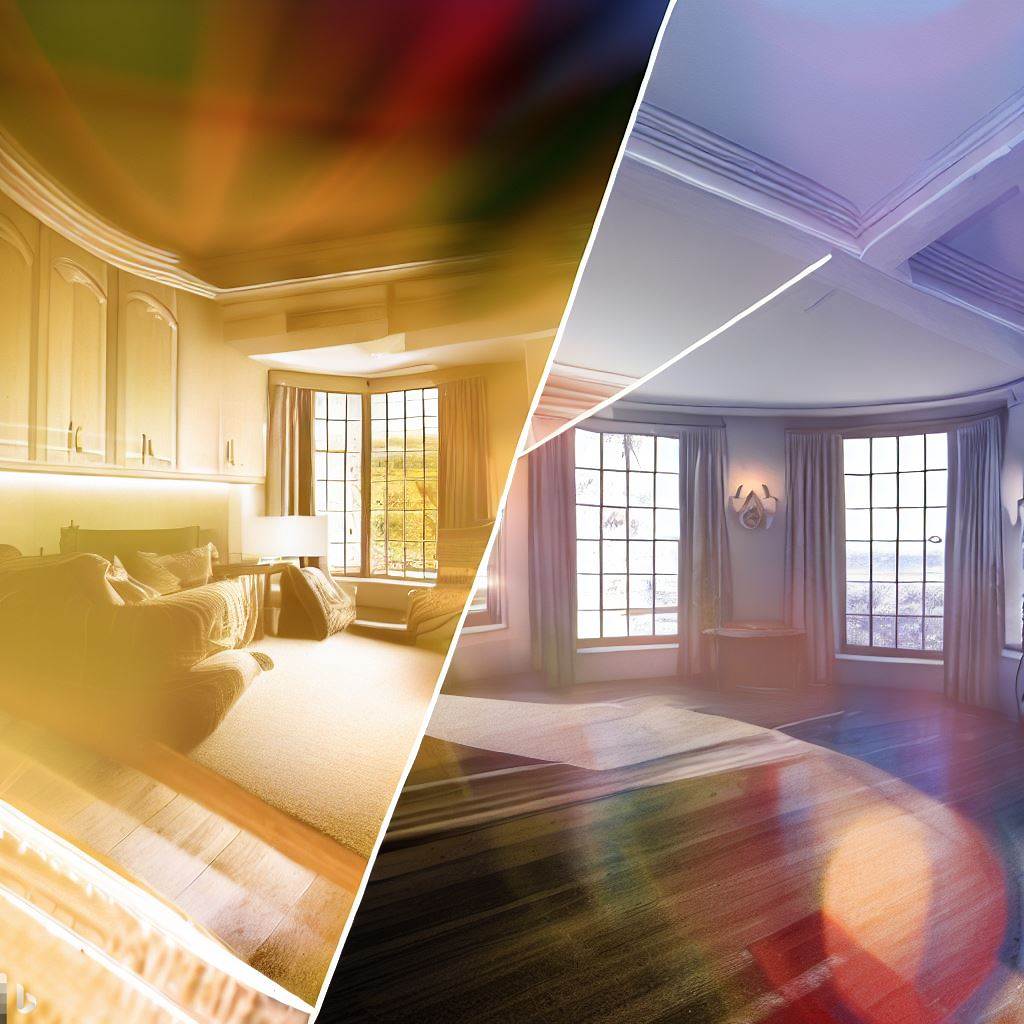
Hot tones
Orange, red, and yellow are the main colors in warm tones. Warm colors help users increase temperature and blood pressure, as opposed to cool tones.
Warm tones are often designed for large spaces, making the composition in the room tighter. Most of this color tone is used for large patches such as walls, walls. Therefore, hot tones are usually not used for small rooms, do not paint intermittently and do not use more than 3 warm colors together.
Some notes when using hot tones:
– Brown not used for people with depression
– Red is not used for children’s rooms because it is an antagonistic color or people with high blood pressure.
– Pink is a color that lacks energy, so it is not used for the office.
– Orange color improves lung function, increases energy, helps sick people recover energy. Therefore, orange can be used in rest spaces, resuscitation or gyms.
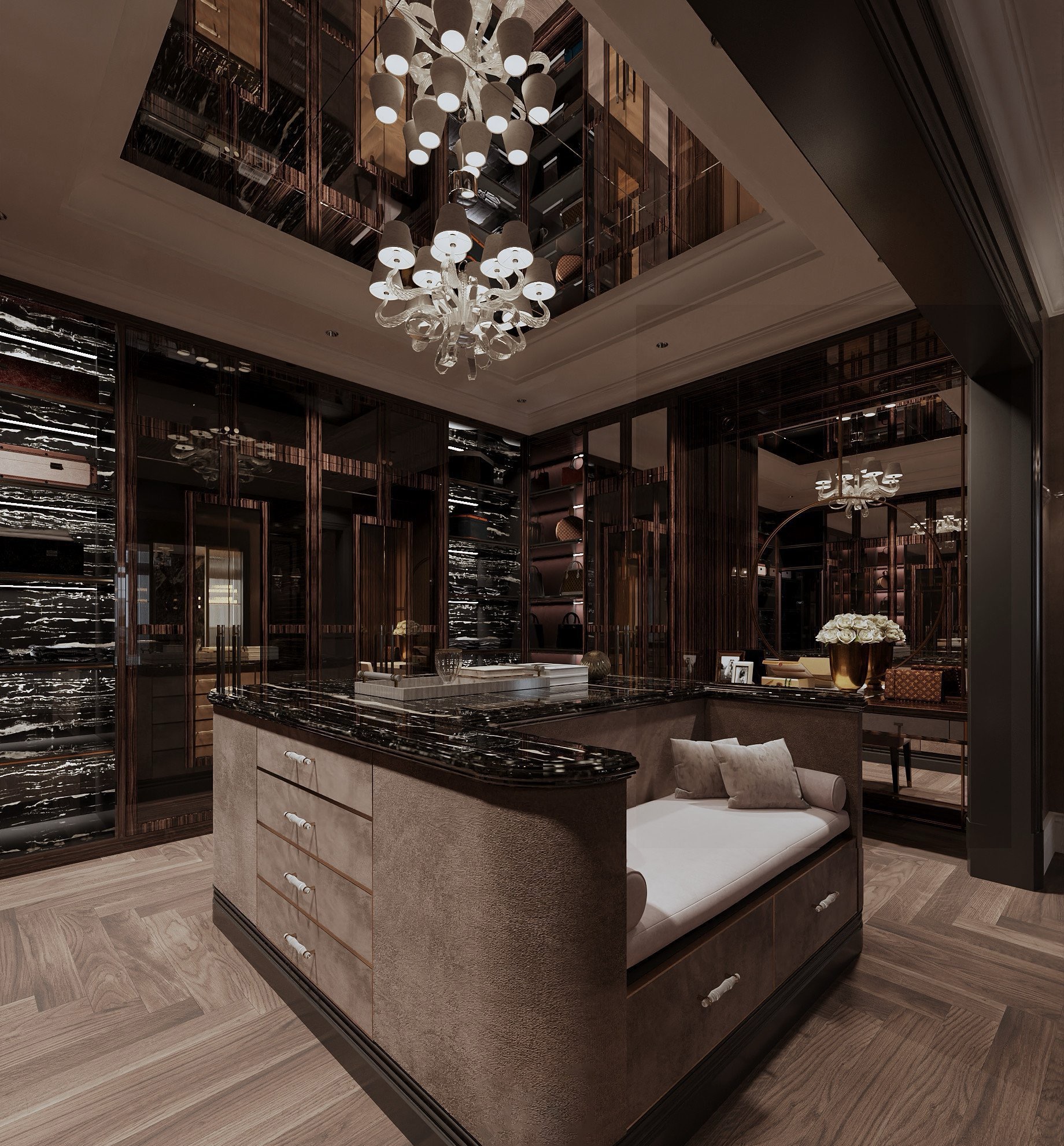
Neutral tones
Neutral tones are the most basic tones in the palette, which can be combined with most colors in the palette. Neutral colors include black, white, gray,…
Not only used in the color scheme in the main space, cool tones or warm tones, neutral tones can also be used as the main color in the space to create a simple but very luxurious space.
In recent years, neutral colors have been used a lot in modern, neoclassical design, European styles also apply a lot of these tones. Neutral tones are not yet hot, expected to continue to be popular for many more years.
Neutral color tones help highlight a friendly, intimate space, helping to create a larger feeling for the space.
Neutral tones are recommended for living room, bedroom, common room,…
You will not need to worry about the space using neutral colors will be monotonous, not stand out because with only a very small accent design, combining 1 few details with warm colors will also help your space brighten up and highlight that accent detail.
How to use color for rooms
In short, color choice in design plays a very important role to help emphasize and make the interior design in your home stand out more. Depending on your preferences and design ideas, you can choose for yourself the right color tone for each room in your home. Here are some color selection suggestions for you:
o The living room uses light colors: you can use the main neutral color or a combination of bright colors like blue or orange with white and gray. Blue and orange help create a warm, soothing feeling, helping to create a pleasant feeling in the room.
o The bedroom uses neutral colors with an emphasis on bright colors to help create a feeling of relaxation and good for your sleep.
o The office should use pastel or beige colors to help clear the mind and flexibility.
o Children’s rooms should use cheerful colors, if they can be combined harmoniously, they should use a few bright colors together to create a positive space for your child.
o Parent/grandparent rooms should be blue-gray or gray. This color is both simple and elegant.
Above are some suggestions for you when choosing colors for your house/apartment. You should also refer to the principle of color scheme to be able to have the perfect choice and best suit your space.